risk-return analysis of the nyse stocks
our goal with this project is to analyse a risk-return relationship of stocks of our choice in order to see which ones should we buy given a specific level of risk aversion. to achieve this goal, we will need to calculate some measurements using descriptive statistics and to plot a few charts.
firstly, we load a dataset nyse.csv containing 508 stocks listed on the new york stock exchange, their unique ticker symbol and name, the ipo_year (initial public offering), as well as the sector and industry the company is in.
nyse <- read_csv(here('static/data', 'nyse.csv'))## Rows: 508 Columns: 6## ── Column specification ────────────────────────────────────────────────────────
## Delimiter: ","
## chr (6): symbol, name, ipo_year, sector, industry, summary_quote##
## ℹ Use `spec()` to retrieve the full column specification for this data.
## ℹ Specify the column types or set `show_col_types = FALSE` to quiet this message.glimpse(nyse)## Rows: 508
## Columns: 6
## $ symbol <chr> "MMM", "ABB", "ABT", "ABBV", "ACN", "AAP", "AFL", "A", "…
## $ name <chr> "3M Company", "ABB Ltd", "Abbott Laboratories", "AbbVie …
## $ ipo_year <chr> "n/a", "n/a", "n/a", "2012", "2001", "n/a", "n/a", "1999…
## $ sector <chr> "Health Care", "Consumer Durables", "Health Care", "Heal…
## $ industry <chr> "Medical/Dental Instruments", "Electrical Products", "Ma…
## $ summary_quote <chr> "https://www.nasdaq.com/symbol/mmm", "https://www.nasdaq…based on this dataset, we create a bar plot that shows the number of companies per sector in descending order. this will give us an idea of which kind of stocks listed on the new york stock exchange we downloaded previously.
nyse %>%
  group_by(sector) %>%
  count(sort=T) %>%
  ggplot(aes(x=n, y=fct_reorder(sector, n))) +
  geom_col() +
  theme_bw() +
  labs(title='number of stocks across sectors', x='number of stocks', y='sector') +
  NULL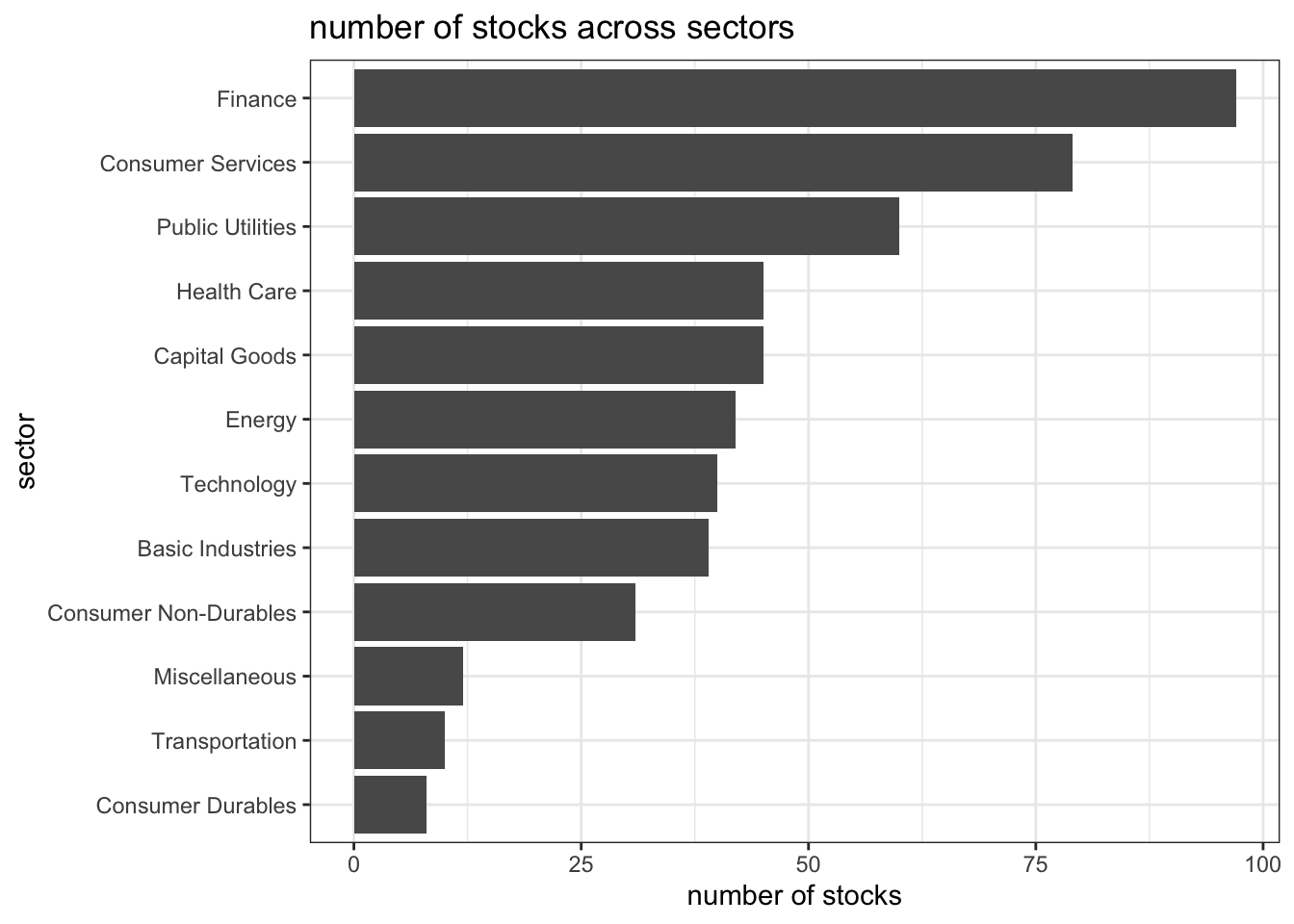
interestingly enough, the new york stock exchange does not prefer technology stocks. from 1971, nasdaq is the place for hot tech stocks that due to cost savings.
now, let’s choose some stocks and download some their historical prices using the tidyquant package. recall that the column symbol can be used to uniquely represent a single stock or index. we are interested in a period from 1st January 2011 to 31st August 2021.
stocks <- c('AAPL', 'JPM', 'DIS', 'DPZ', 'ANF', 'SPY') %>%
  tq_get(get='stock.prices',
         from='2011-01-01',
         to='2021-08-31') %>%
  group_by(symbol)
## Warning: `type_convert()` only converts columns of type 'character'.
## - `df` has no columns of type 'character'
## Warning: `type_convert()` only converts columns of type 'character'.
## - `df` has no columns of type 'character'
## Warning: `type_convert()` only converts columns of type 'character'.
## - `df` has no columns of type 'character'
## Warning: `type_convert()` only converts columns of type 'character'.
## - `df` has no columns of type 'character'
## Warning: `type_convert()` only converts columns of type 'character'.
## - `df` has no columns of type 'character'
## Warning: `type_convert()` only converts columns of type 'character'.
## - `df` has no columns of type 'character'glimpse(stocks)## Rows: 16,098
## Columns: 8
## Groups: symbol [6]
## $ symbol <chr> "AAPL", "AAPL", "AAPL", "AAPL", "AAPL", "AAPL", "AAPL", "AAPL…
## $ date <date> 2011-01-03, 2011-01-04, 2011-01-05, 2011-01-06, 2011-01-07, …
## $ open <dbl> 11.63000, 11.87286, 11.76964, 11.95429, 11.92821, 12.10107, 1…
## $ high <dbl> 11.79500, 11.87500, 11.94071, 11.97321, 12.01250, 12.25821, 1…
## $ low <dbl> 11.60143, 11.71964, 11.76786, 11.88929, 11.85357, 12.04179, 1…
## $ close <dbl> 11.77036, 11.83179, 11.92857, 11.91893, 12.00429, 12.23036, 1…
## $ volume <dbl> 445138400, 309080800, 255519600, 300428800, 311931200, 448560…
## $ adjusted <dbl> 10.10622, 10.15897, 10.24207, 10.23379, 10.30708, 10.50119, 1…financial performance analysis depend on returns; if we buy a stock today for 100 and we sell it tomorrow for 101.75, our one-day return, assuming no transaction costs, is 1.75%. so given the adjusted closing prices, the first step is to calculate monthly returns for our stocks.
stocks_returns_monthly <- stocks %>%
  tq_transmute(select=adjusted,
               mutate_fun=periodReturn,
               period='monthly',
               type='arithmetic',
               col_rename='monthly_returns',
               cols=c(nested.col))
## Warning: `type_convert()` only converts columns of type 'character'.
## - `df` has no columns of type 'character'
## Warning: `type_convert()` only converts columns of type 'character'.
## - `df` has no columns of type 'character'
## Warning: `type_convert()` only converts columns of type 'character'.
## - `df` has no columns of type 'character'
## Warning: `type_convert()` only converts columns of type 'character'.
## - `df` has no columns of type 'character'
## Warning: `type_convert()` only converts columns of type 'character'.
## - `df` has no columns of type 'character'
## Warning: `type_convert()` only converts columns of type 'character'.
## - `df` has no columns of type 'character'now we create a table where we summarise monthly returns for each of the stocks and spy index. already, we can see that anf is the most volatile stock in our selection even though it generates 0.5 monthly return at one point in time. our conclusion is solely based on the value of standard deviation. the higher value implies more risk due to uncertainty present in pricing of the observed stock. furthermore, dpz gives its investors the highest mean monthly return.
stocks_returns_monthly %>%
  group_by(symbol) %>%
  summarise(
    min=min(monthly_returns),
    max=max(monthly_returns),
    median=median(monthly_returns),
    mean=mean(monthly_returns),
    sd=sd(monthly_returns))
## # A tibble: 6 × 6
## symbol min max median mean sd
## <chr> <dbl> <dbl> <dbl> <dbl> <dbl>
## 1 AAPL -0.181 0.217 0.0257 0.0245 0.0785
## 2 ANF -0.421 0.507 0.00287 0.00922 0.145
## 3 DIS -0.179 0.234 0.00946 0.0155 0.0682
## 4 DPZ -0.188 0.342 0.0253 0.0314 0.0746
## 5 JPM -0.229 0.202 0.0225 0.0152 0.0722
## 6 SPY -0.125 0.127 0.0174 0.0123 0.0381next, for each of the stocks we make a density plot, using geom_density(), that will show us the underlying distribution of the observed stock prices.
stocks_returns_monthly %>%
  ggplot(aes(x=monthly_returns, colour=symbol, fill=symbol)) +
  geom_density(alpha=0.3) +
  facet_wrap(~symbol) +
  theme_bw() +
  theme(legend.position='none') +
  labs(title='density plot of monthly returns', x='return', y='density') +
  NULL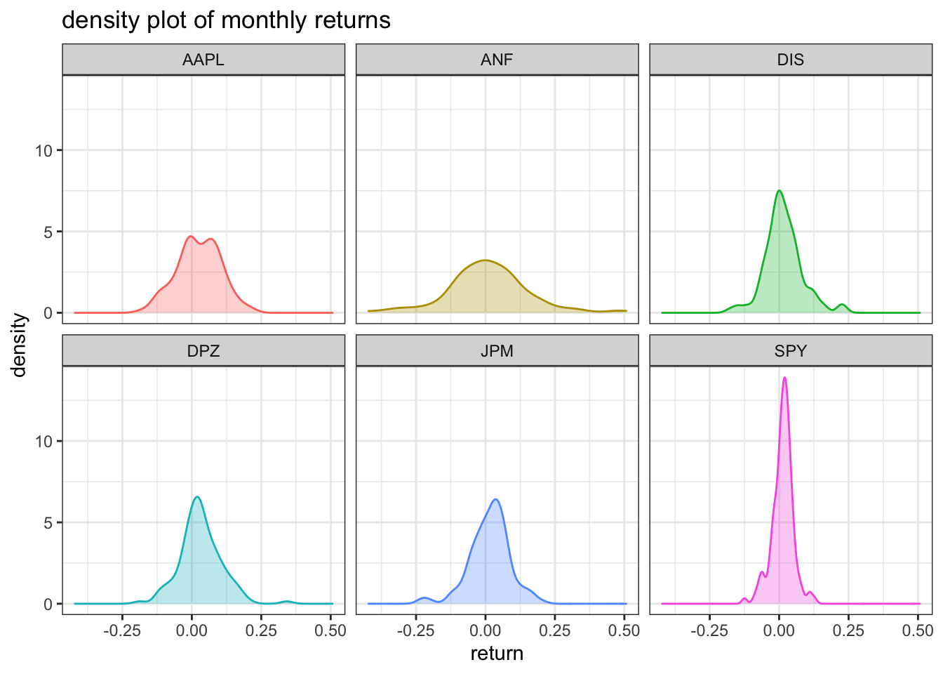
plotting the monthly returns for the stocks of various companies over time helps us determine the level of risk involved in such investments. according to the density plot, the riskiest stock is anf, which confirms our conclusion from above, and the least risk is involved in spy, which makes sense because it is comprised of multiple stocks with a goal of diversification.
finally, make a plot that shows the expected monthly return (mean) of a stock on the y axis and the risk (sd) in the x-axis.
stocks_returns_monthly %>%
  group_by(symbol) %>%
  summarise(
    sd=sd(monthly_returns),
    mean=mean(monthly_returns)) %>%
  ggplot(aes(x=sd, y=mean, label=symbol)) +
  geom_point() +
  theme_bw() +
  geom_text_repel() +
  labs(title='risk and return plot for selected stocks', x='risk', y='return') +
  NULL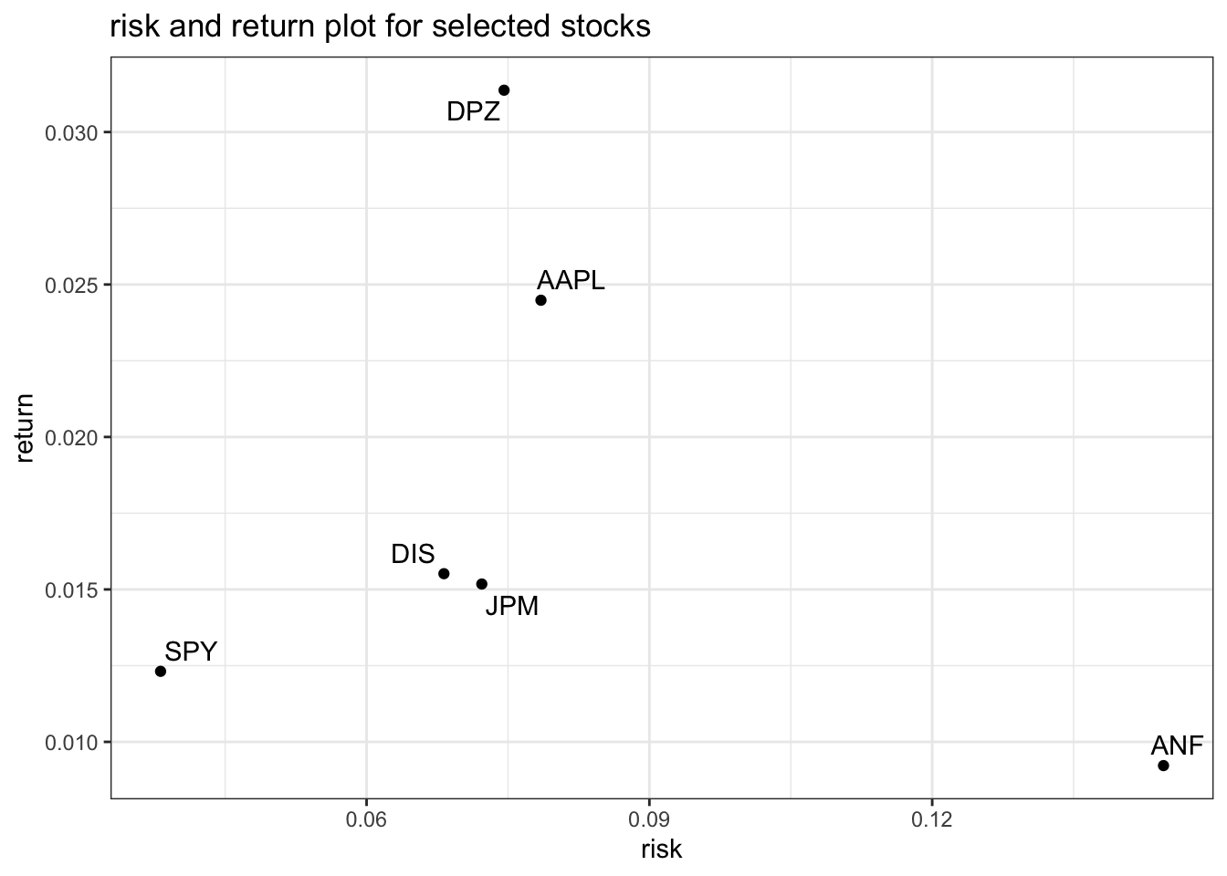
this plot depicts the risk-return relationship of each stock. while dpz provides the highest return for a moderate risk level, anz despite being the riskiest provides the least amount of return. the definitive answer to the question of the most profitable stock given a certain risk aversion can be found by utilising some advanced methods.
for in-depth explanation of the code written above, take a look at these finance data sources.
important note: parts of this page including text and code are taken from kostis christodoulou and the 10th study group for applied statistics in r course at london business school