excess rentals in tfl bike sharing
we are interested in finding out how much are rentals for each year are different from the 6-year monthly average. why do we want to know such a weird metric? well, we might want to compare the effect of some management decisions over time. the difference in differences method, but we will keep this simple and compare only monthly bike rentals over 6 years.
firstly, let us load the data and take a look at the first few rows. we do this by loading a pretty small dataset tfl-daily-cycle-hires.csv.
bike_raw <- read_csv(here('static/data', 'tfl-daily-cycle-hires.csv'))## Rows: 4020 Columns: 2## ── Column specification ────────────────────────────────────────────────────────
## Delimiter: ","
## chr (1): date
## dbl (1): bikes_hired##
## ℹ Use `spec()` to retrieve the full column specification for this data.
## ℹ Specify the column types or set `show_col_types = FALSE` to quiet this message.glimpse(bike_raw)## Rows: 4,020
## Columns: 2
## $ date <chr> "30/07/2010", "31/07/2010", "01/08/2010", "02/08/2010", "0…
## $ bikes_hired <dbl> 6.897, 5.564, 4.303, 6.642, 7.966, 7.893, 8.724, 9.797, 6.…secondly, we will need to format our data to be compatible with the calculations we are going to perform in the next step. column data will be converted from character to date datatype. also, we want to extract year, month, and week information from this column which will allow us to group and visualise data. apart from this, we will keep only records for rentals that happened from 2016. take a look at the first few rows of the newly created dataset using glimpse function again.
bike <- bike_raw %>%
  mutate(
    date=dmy(date),
    year=year(date),
    month=month(date, label=T),
    week=isoweek(date)) %>%
  filter(year > 2015)

glimpse(bike)
## Rows: 2,039
## Columns: 5
## $ date <date> 2016-01-01, 2016-01-02, 2016-01-03, 2016-01-04, 2016-01-0…
## $ bikes_hired <dbl> 9.922, 7.246, 4.894, 20.644, 22.934, 23.199, 18.225, 20.94…
## $ year <dbl> 2016, 2016, 2016, 2016, 2016, 2016, 2016, 2016, 2016, 2016…
## $ month <ord> Jan, Jan, Jan, Jan, Jan, Jan, Jan, Jan, Jan, Jan, Jan, Jan…
## $ week <dbl> 53, 53, 53, 1, 1, 1, 1, 1, 1, 1, 2, 2, 2, 2, 2, 2, 2, 3, 3…next, we calculate the difference between expected and actual rentals for each month for each year in the observed 6-year period. to achieve this, we calculate a mean for each out of 12 months in a year across the whole dataset. we have just calculated the expected_rentals column. for the actual_rentals columns we need to perform the same thing but with additional grouping by year. after creating two separate datasets with the above-mentioned information, we need to join them into a single dataset. we do this by using the inner_join function. now, here comes a bit more complicated stuff. because we want to add a green/red ribbon that will show us how much is the number of actual rentals different from the expected rentals. the only way to display a ribbon is from the leftmost to the rightmost point on the plot so we need a way to hide/show a specific ribbon based on the difference between the number of rentals. this can easily be done by adding 2 new columns called up and down which will represent the highest and the lowest point of each ribbon for a specific value on the x-axis.
bike_exp <- bike %>%
  group_by(month) %>%
  summarise(expected_rentals=mean(bikes_hired))

bike_act <- bike %>%
  group_by(year, month) %>%
  summarise(actual_rentals=mean(bikes_hired))
## `summarise()` has grouped output by 'year'. You can override using the `.groups` argument.bike_plot <- bike_exp %>%
inner_join(bike_act, by='month') %>%
mutate(
up=if_else(actual_rentals > expected_rentals, actual_rentals - expected_rentals, 0),
down=if_else(actual_rentals < expected_rentals, expected_rentals - actual_rentals, 0))we are almost there. the only thing that is left is to visualise the dataset we have just prepared. we are using regular line plots to show the number of rentals per month. these plots are faceted by year. the blue line shows the 6-year monthly average.
bike_plot %>%
  ggplot(aes(x=month)) +
  geom_line(aes(y=actual_rentals, group=1), size=0.1, colour='black') +
  geom_line(aes(y=expected_rentals, group=1), size=0.7, colour='blue') +
  geom_ribbon(aes(ymin=expected_rentals, ymax=expected_rentals+up, group=1), fill='#7DCD85', alpha=0.4) +
  geom_ribbon(aes(ymin=expected_rentals, ymax=expected_rentals-down, group=1), fill='#CB454A', alpha=0.4) +
  facet_wrap(~year) +
  theme_bw() +
  labs(
    title="Monthly changes in TfL bike rentals",
    subtitle="Change from monthly average shown in blue and calculated between 2016-2019",
    x="",
    y="Bike rentals") +
  NULL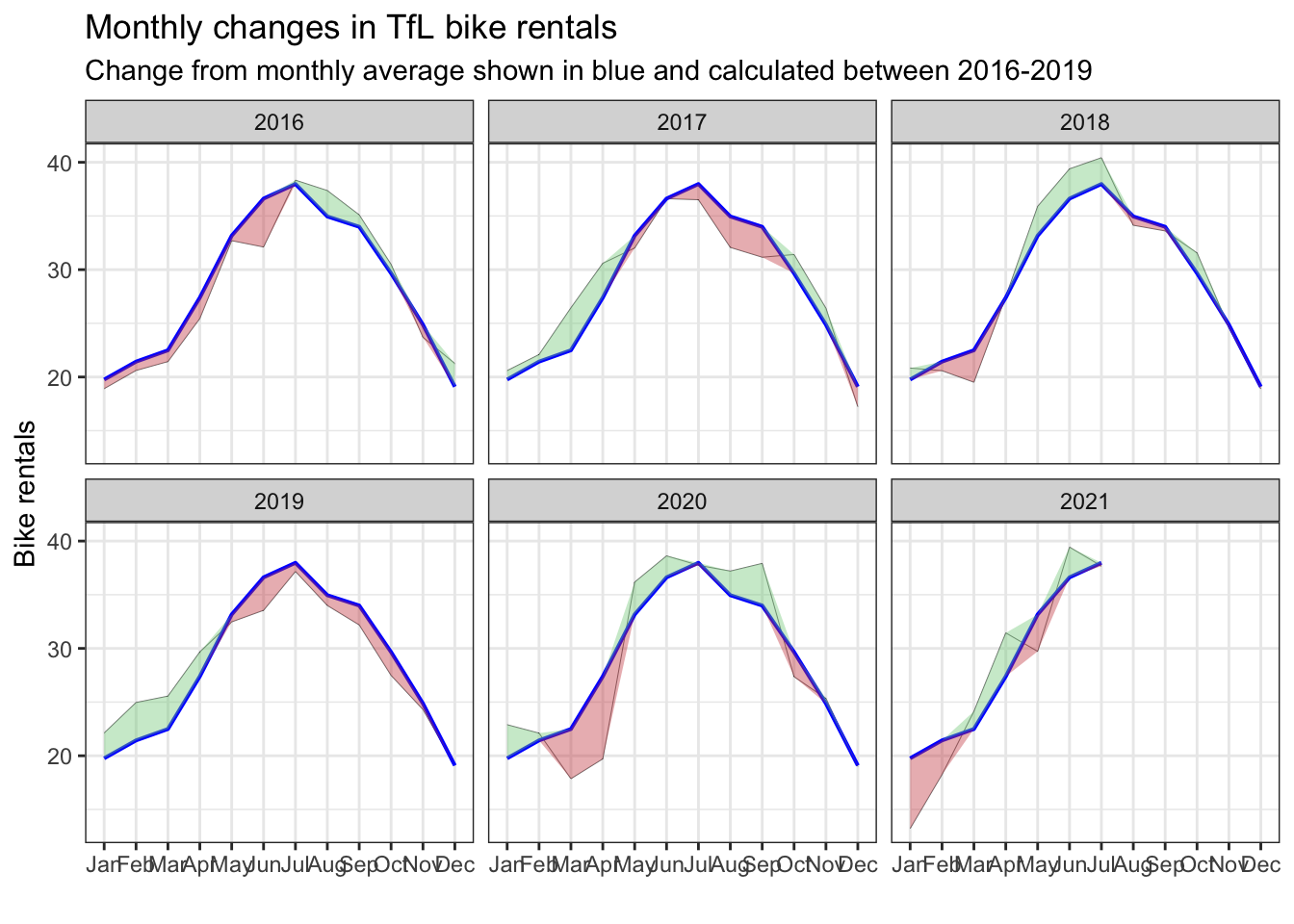
bam! this looks beautiful.
important note: parts of this page including text and code are taken from kostis christodoulou and the 10th study group for applied statistics in r course at london business school